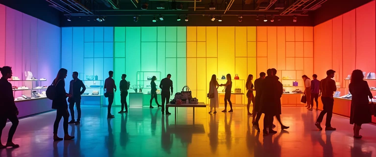
7 Color Psychology Secrets for a Happy Store That Boosts Sales
Ever walked into a store and felt an immediate mood shift? That's no accident. The most successful retailers harness the power of color psychology to create a happy store environment that not only welcomes customers but subtly guides their purchasing decisions. Research shows that colors influence up to 85% of consumer purchasing decisions, making your color palette one of your most powerful sales tools.
Creating a truly happy store goes beyond just picking colors you like. It's about strategically selecting hues that evoke specific emotional responses and purchasing behaviors. Major retailers invest significantly in color research because they understand that the right palette can increase browsing time by up to 40% and boost sales by 15-32%. When customers feel good in your space, they build positive associations that keep them coming back.
The science behind a happy store color strategy is fascinating – different wavelengths of light trigger specific neurological responses, influencing everything from heart rate to spending behavior. Let's explore the seven most powerful colors for transforming browsers into buyers.
The 7 Essential Colors for Your Happy Store Success
Implementing these seven colors strategically throughout your happy store creates an environment that guides customers through their shopping journey while subtly encouraging purchases:
1. Red: The Action Trigger
Red stimulates excitement and creates urgency in your happy store environment. This powerful color increases heart rate and creates a sense of energy that's perfect for clearance sections, sale signage, or impulse purchase displays. Major fast-food chains use red extensively because it actually stimulates appetite and encourages quick decisions – exactly what you want for high-turnover products.
2. Blue: The Trust Builder
Blue builds trust and calm in a happy store, making it ideal for technology sections, financial services areas, or high-consideration purchases. Studies show that blue environments actually lower blood pressure and create feelings of stability. Shoppers spend 15% more time browsing in blue sections of stores and report higher satisfaction with their purchases afterward.
3. Yellow: The Attention Grabber
Yellow generates optimism and captures attention in your happy store displays. This sunny hue is perfect for window displays, entry points, and highlighting new merchandise. Yellow is processed by the brain first among all colors, making it the most visible to the human eye – which explains why it's used for everything from sale tags to "new arrival" signage in effective retail environments.
4. Green: The Relaxation Promoter
Green promotes relaxation and wellness in a happy store atmosphere. It's associated with nature, health, and tranquility, making it perfect for eco-friendly products, wellness sections, or areas where you want customers to linger. Research shows green environments reduce anxiety, encouraging shoppers to spend 19% more time exploring merchandise.
5. Purple: The Luxury Signifier
Purple evokes luxury and creativity in happy store designs. Historically associated with royalty and wealth, purple creates perceptions of premium quality and exclusivity. Use it for high-end product displays, beauty sections, or anywhere you want to create a sense of indulgence and special treatment.
6. Orange: The Impulse Activator
Orange combines the energy of red with the cheerfulness of yellow, creating a happy store atmosphere that feels both welcoming and exciting. This vibrant color is perfect for calls-to-action, limited-time offers, and creating a sense of affordable fun. Studies show orange environments can increase impulse purchases by up to 26%.
7. Pink: The Stress Reducer
Pink creates a soothing, nurturing environment in your happy store. This color has been shown to temporarily lower aggression and create feelings of warmth and comfort. Use soft pinks in fitting rooms, rest areas, or sections targeting female shoppers for maximum effect.
Implementing Your Happy Store Color Strategy for Maximum Impact
Creating an effective happy store color strategy requires mapping your customer journey to specific color zones. Start by identifying key decision points in your store layout, then assign appropriate colors to each area based on the emotions you want to evoke.
Consider implementing seasonal color adjustments to maintain a fresh happy store experience throughout the year. Rotating accent colors keeps your environment feeling new and exciting for repeat customers while maintaining brand consistency. This environmental psychology technique has been shown to increase return visits by up to 24%.
Testing your happy store color effectiveness doesn't require major renovations. Start with simple changes like colored signage, strategic lighting, or painted feature walls in key areas. Track sales data before and after color implementations to measure impact. One apparel retailer saw a 37% increase in dressing room conversions simply by changing room colors from beige to a soft, flattering pink.
Remember that a truly happy store environment balances stimulation with comfort. Too many bright colors can create anxiety, while too many muted tones might fail to engage shoppers. The most successful happy store designs use dominant neutral colors (60%) with complementary secondary colors (30%) and strategic accent colors (10%) for maximum psychological impact.


